Pull
  • Home
  • Work
  • About
  • Contact

NuPath

Creating a community connection.

Services

  • Website
  • Marketing Collateral
  • App Logo
  • SEO

Overview

NuPath provides essential support for individuals with disabilities and significant life challenges to live, work, learn, grow and participate to their fullest potential in the community.

Challenge

  • Digital and print communications lacked a cohesive look and feel to express the personality, culture, and emotion that is NuPath. The materials were unprofessional and did not live up to the stature of the organization.
  • The NuPath website was outdated, disorganized, and not capable of delivering dynamic content. The navigation was confusing and the site lacked key content as a result of organizational growth.
  • NuPath pioneered an app which tracks and records group location using GPS and is used to coordinate group and individual activities, enabling greater freedom and independence within the community. A logo was needed to represent the technology and serve as a UI icon.
  • NuPath produces an annual report that summarizes accomplishments and vision for moving forward. Previous reports lacked professional design, format, and a true sense NuPath’s culture.

Solution

  • A color palette, brand font, and suite of graphic elements were created to give visual consistency across all communications along with guidelines for usage. Email and collateral templates were created for easy in-house use. The new system served as the foundation for building a new website and designing the annual report.
  • Once the core needs and target audiences were determined a content strategy was developed. An audit was conducted to filter and organize current and new content, which was then flowed into a sitemap and interactive wireframe. Core communications and stories were improved through content flow, page structure, and copywriting. Keyword research was conducted and SEO is baked into both content and HTML framework. The back-end is built in WordPress, enabling easy management and the ability to leverage dynamic content.
  • A bold, memorable logo was designed for the flagship app that incorporates clean bold lines and map markers to create the NL mark. It’s simplicity allows for legibility and for it to stand out on a screen crowded with other apps.
  • The annual report followed the new brand identity and featured a unique size with engaging die cuts and clear, bold graphics to communicate key information.

Result

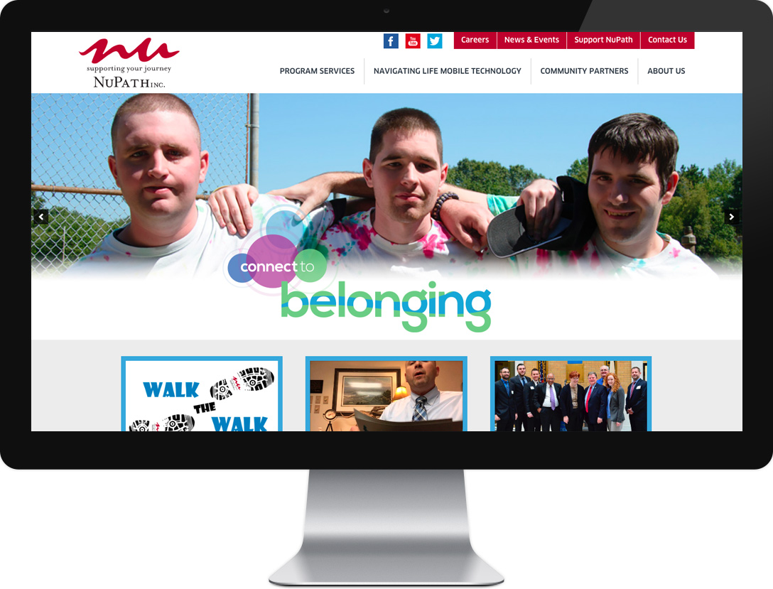
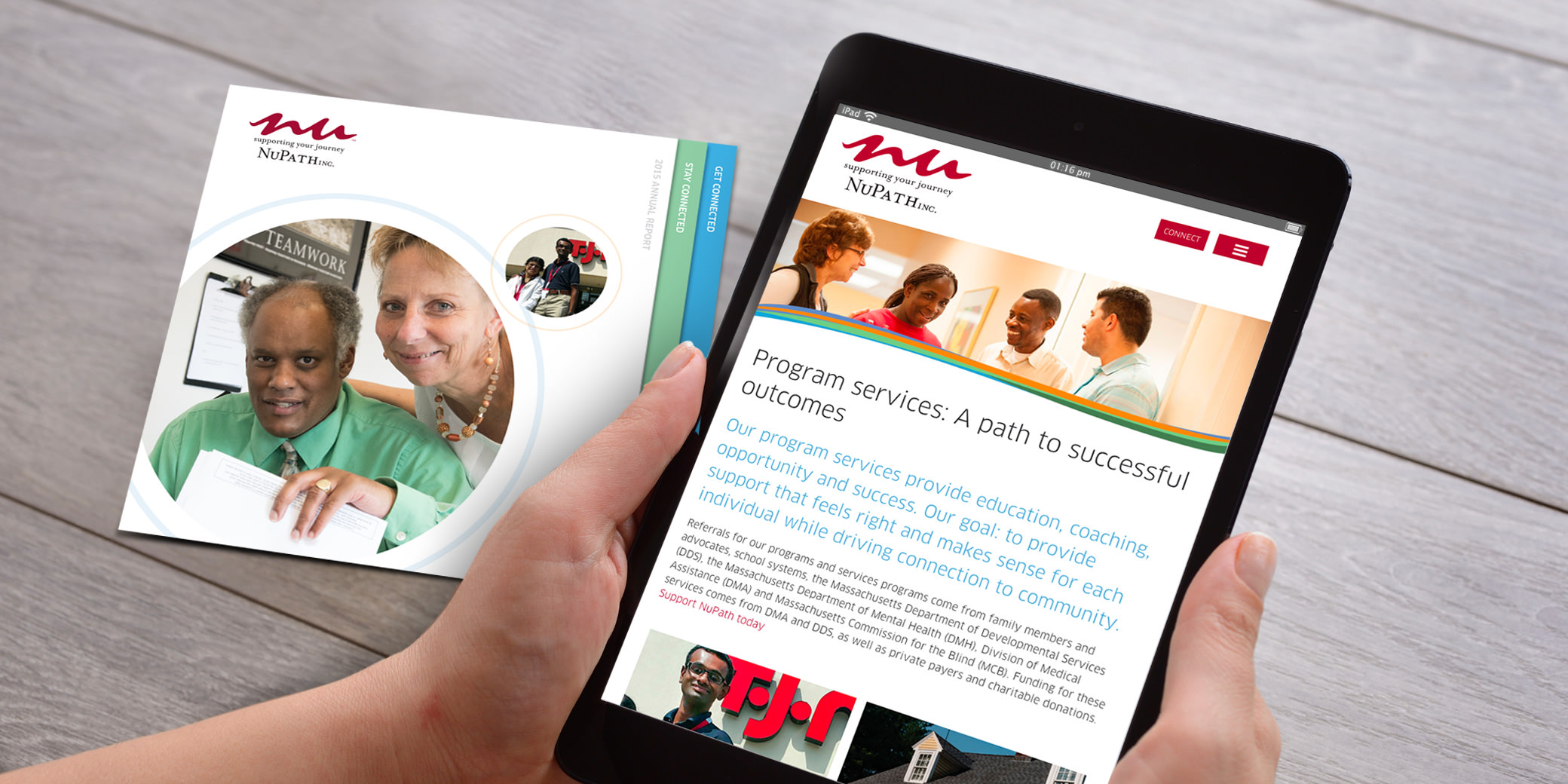
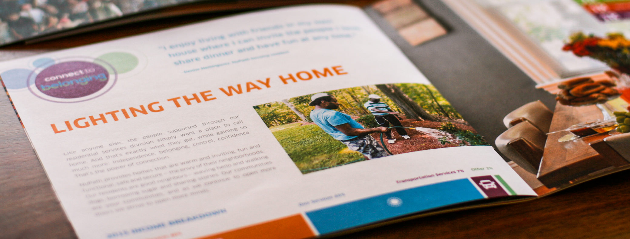
The new branding system created visual consistency at every touch point resulting in positive feedback from the community and key stakeholders. Engagement increased across the board from a mix of online activity through the website and response to the annual report and other collateral.

The new framework made it easy to step up marketing and outreach programs, capturing a larger audience, a higher response rate, and moving them to action – to get connected and stay connected.

“Pull has played an integral role in NuPath’s brand development through stunning print collateral and an online presence. They have presented a beautifully balanced approach to creative exploration that has transformed the way our stakeholder base and beyond see our organization and embrace our mission.”

Daniel Harrison
President and CEO, NuPath

Visit The Website

Back to Work

Ready to start your next project?

Let's talk.

617.356.8248

  • This field is for validation purposes and should be left unchanged.

Pull
  • © 2023
  • Pull, LLC
  • 617.356.8248